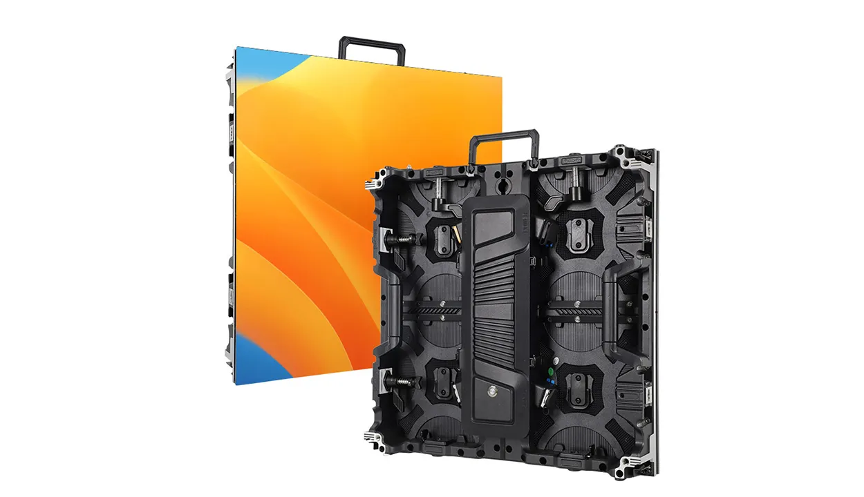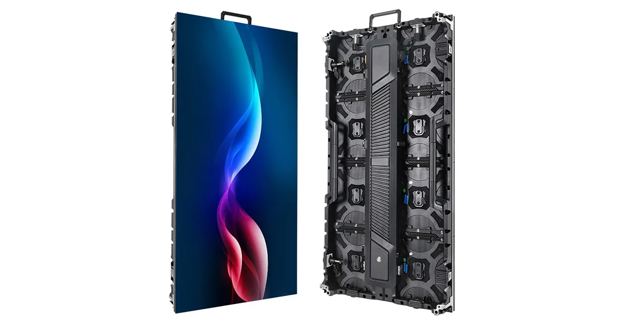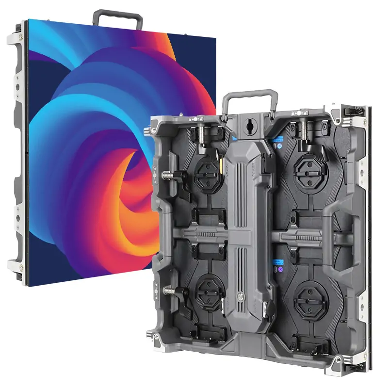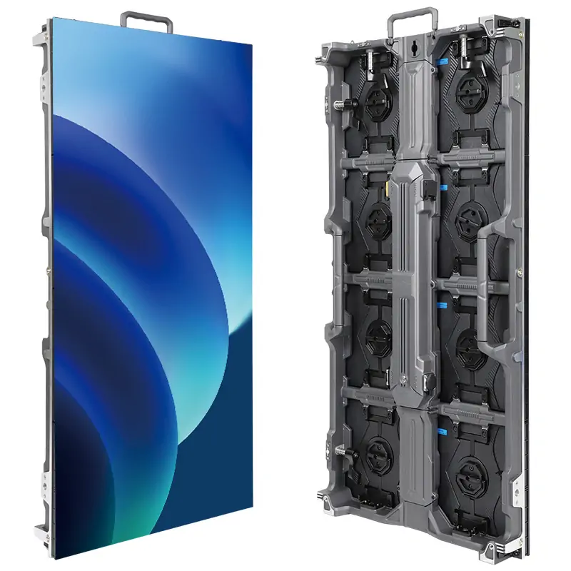
Screen aspect ratio is the width of a display divided by its height. For an LED wall, choose a ratio that fits your content and installation: 16:9 is a useful starting point for landscape video and presentations, 9:16 for portrait content, and 4:3, 16:10, 21:9, 32:9 or 1:1 for specific layouts. Confirm the wall’s native pixel dimensions before ordering.
This guide compares those formats, explains how to calculate screen dimensions, and shows where custom shapes make sense. Aspect ratio sets the shape; pixel pitch, resolution and viewing distance determine whether the finished display can show your content clearly.
1.What is screen aspect ratio?
Screen aspect ratio is written as width:height. A 16:9 display is 16 units wide for every 9 units high, whether those units are pixels, millimeters or meters. A 4:3 display is proportionally taller, while 9:16 turns the familiar widescreen shape upright.
For a 1920 × 1080 image with square pixels, divide both dimensions by their greatest common divisor, 120: the result is 16:9, or about 1.778:1. This assumes square pixels. Some video formats use non-square pixels, so their pixel count alone does not describe the displayed shape; see Adobe’s explanation of pixel aspect ratio.
The thing people confuse: aspect ratio vs resolution
Aspect ratio describes shape; LED screen resolution describes the number of pixels across and down. Two screens can have the same shape but very different detail, physical size and processing requirements.
For example, 1280 × 720, 1920 × 1080, 2560 × 1440 and 3840 × 2160 are all 16:9 when pixels are square. Moving from Full HD to 4K UHD doubles each pixel dimension and quadruples the total pixel count without changing the shape.
Scaling both dimensions by the same factor preserves the ratio. Changing 1920 × 1080 to 1920 × 1200 changes it to 16:10. To show a different ratio on a fixed screen, choose whether to fit it with empty borders, crop it to fill, or stretch it. Stretching changes the proportions of people, logos and text.
2.Why screen aspect ratio matters for LED displays specifically
Unlike a fixed-size television, an LED display is assembled from modules and cabinets. Designers can build a landscape wall, a narrow ribbon, a portrait display or a square installation. The available cabinet dimensions determine which finished sizes are practical; the desired ratio must also fit the structure, service access and installation space.
The content and control system still need a defined pixel canvas. Before selecting cabinets, list the source formats and the areas where each will appear. A physically possible wall shape is useful only if its content remains readable and the processor can drive its full resolution.
2.1 The content compatibility trap
16:9 is common in HD video and presentations, but it is not universal. Microsoft identifies widescreen 16:9 as PowerPoint’s default for new presentations, while also supporting 4:3 and custom sizes. Check the actual slide files, camera outputs and media-player settings instead of assuming that every source matches.
When the source and wall have different ratios, fitting the whole image leaves unused space; filling the wall crops part of the image; stretching distorts it. Agree on that behavior during design. A test slide containing a circle, a logo and text near all four edges makes these differences easy to see.
For example, a 1900 × 500 pixel ribbon has a 19:5 ratio. A standard 16:9 video cannot fill that canvas proportionally without cropping. You could keep the video in a correctly shaped window and use the remaining width for graphics, or create an export specifically for the full ribbon.
2.2 How 16:9 became the standard
16:9 has an established role in HDTV: ITU-R BT.709 specifies a 16:9 picture format with 1920 × 1080 active samples and square pixels. That makes it a practical reference for projects built around HD video.
However, an LED display manufacturer may offer cabinets in several shapes, and those cabinets can form many wall ratios. The overall ratio does not by itself determine product availability, price or spare-part compatibility. Compare the proposed cabinet layout and the exact specifications.
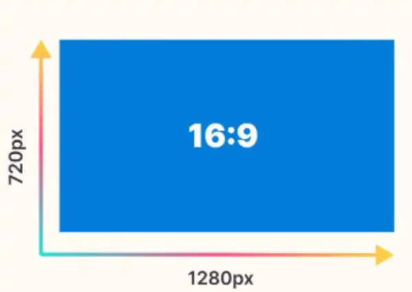
The illustration below shows the same 16:9 relationship at 1280 pixels wide by 720 pixels high. Use 16:9 as a starting point when it matches your sources, then check the installation dimensions and native resolution.
3. Seven screen aspect ratios for LED projects
These seven formats cover useful starting points for LED projects. Compare the intended content, available width and height, and the number of simultaneous windows. For wide formats marketed under a rounded label, always specify the exact pixel canvas as well.
16:9
A practical choice for landscape video, meeting presentations, camera feeds and general signage when the sources use the same ratio. Common resolutions include 1920 × 1080 and 3840 × 2160. A 3.20 m wide 16:9 active image is 1.80 m high. Confirm that the chosen cabinets can actually form those dimensions; the ratio alone does not guarantee a standard cabinet configuration.
4:3
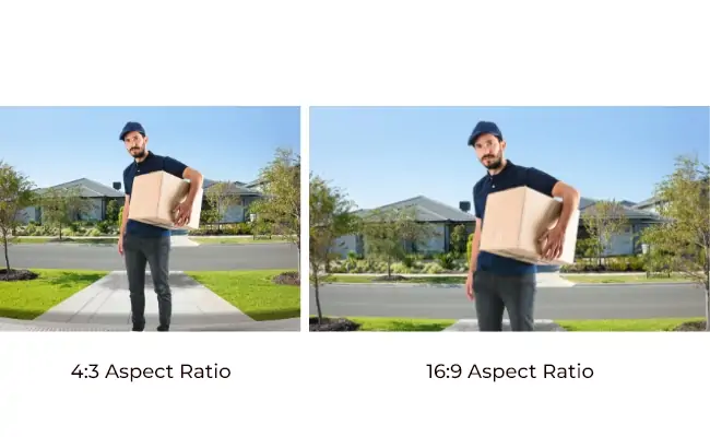
Useful for older presentation libraries, archive video, certain data layouts or an existing opening that suits this shape. Examples include 1024 × 768 and 1600 × 1200. Fitting 16:9 content inside a 4:3 screen creates bars above and below—letterboxing. Fitting 4:3 content inside a 16:9 screen creates bars at the sides—pillarboxing. Cropping is another option, but may remove essential information; Adobe illustrates the letterboxing and cropping tradeoff.
21:9
An ultrawide format for panoramic visuals or a video window alongside other information on an LED wall. Exact 21:9 equals 2.333:1; it is not identical to the 2.39:1 scope format used in DCI cinema test material. Products described as “21:9” may use different native ratios. Specify the exact resolution and test each movie or graphic: 16:9 content fitted proportionally will leave space at the sides.
9:16
The portrait counterpart of 16:9, commonly represented by 1080 × 1920 pixels. It suits upright retail signage and portrait video when the composition is designed for that orientation. Check export resolution, codec, rotation settings and safe areas for text. Landscape material needs a separate layout, cropping, or empty space above and below.
1:1
A square display has equal width and height, such as a 1080 × 1080 pixel canvas. It can suit a square recess, product graphic or artistic installation. Landscape and portrait assets usually need reframing. Check the cabinet grid and content workflow before choosing a square shape solely for its appearance.
32:9
Twice the width of 16:9 at the same height. A 3840 × 1080 canvas can hold two 1920 × 1080 windows side by side, making it useful for dashboards, menu boards and panoramic layouts. Processor capacity depends on the actual pixel count, maximum dimensions and input configuration, not just the 32:9 label.
16:10
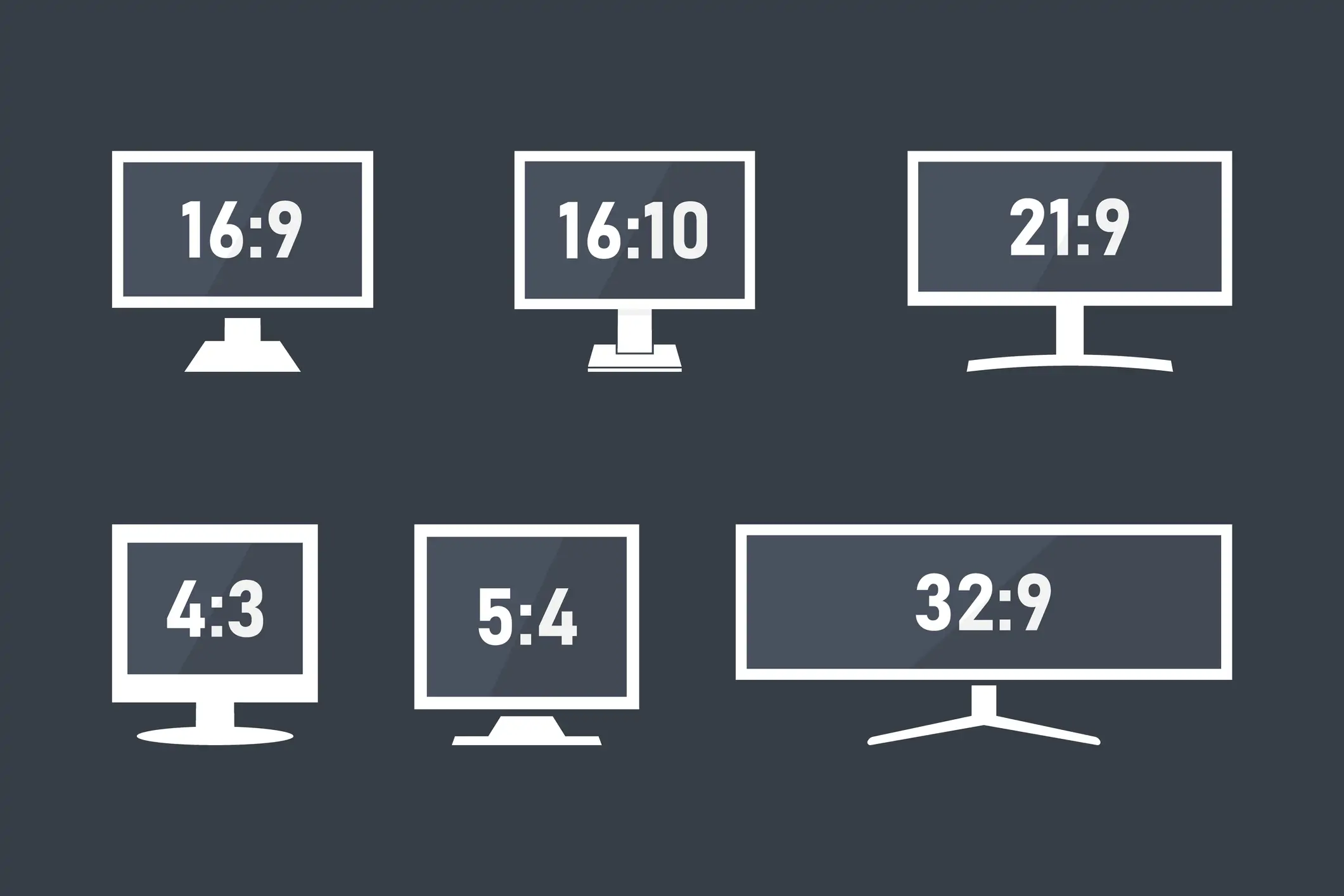
A slightly taller landscape format, such as 1920 × 1200. At equal width, it has about 11.1% more height than 16:9, which can help with documents and data. A fitted 16:9 video leaves bars above and below. The comparison image also includes 5:4: five units wide by four high, or 1.25:1, as in 1280 × 1024 pixels. These shape differences do not establish brightness or image quality.
4. How to do the sizing math
4.1 Finding the aspect ratio from pixel dimensions
Divide width and height by their greatest common divisor (GCD). For 1920 × 1080, the GCD is 120, giving 16:9. For 3840 × 2160, divide by 240 for 16:9. For 1024 × 768, divide by 256 for 4:3. Use consistent units and square pixels when calculating from resolution.
To find dimensions from a known height, multiply height by width-ratio ÷ height-ratio. A 2 m high 16:9 image is about 3.56 m wide; a 2 m high 4:3 image is about 2.67 m wide. These are active image dimensions, excluding frames and installation clearances.
4.2 From pixel pitch to physical dimensions
Physical dimension (meters) = pixel count × pixel pitch (millimeters) ÷ 1000. Full HD at an exact 2.5 mm pitch gives 1920 × 2.5 ÷ 1000 = 4.80 m wide and 1080 × 2.5 ÷ 1000 = 2.70 m high. 4K UHD at 1.5 mm gives 5.76 × 3.24 m.
Working backward, divide the active width in millimeters by the pitch to estimate horizontal pixels. Then confirm whole-module and whole-cabinet counts; a nominal pitch label may be rounded. Use the pixel pitch selection guide to balance viewing distance, detail and budget before fixing the resolution.
4.3 Quick lookup table
These theoretical 16:9 dimensions assume the exact stated pitch and are rounded to 0.01 m. Real cabinet combinations may differ. The final column estimates visual-acuity distance using pitch in millimeters × 3.438, following Planar’s viewing-distance guidance. It estimates when individual pixels become indistinguishable to someone with 20/20 vision; it is not a minimum distance or a guarantee of comfortable reading. Test actual content.
| Pixel Pitch | Full HD (1920×1080) | 4K UHD (3840×2160) | Estimated visual-acuity distance |
|---|---|---|---|
| P1.2 | 2.30 × 1.30 m | 4.61 × 2.59 m | 4.1 m |
| P1.5 | 2.88 × 1.62 m | 5.76 × 3.24 m | 5.2 m |
| P1.8 | 3.46 × 1.94 m | 6.91 × 3.89 m | 6.2 m |
| P2.0 | 3.84 × 2.16 m | 7.68 × 4.32 m | 6.9 m |
| P2.5 | 4.80 × 2.70 m | 9.60 × 5.40 m | 8.6 m |
| P3.0 | 5.76 × 3.24 m | 11.52 × 6.48 m | 10.3 m |
| P4.0 | 7.68 × 4.32 m | 15.36 × 8.64 m | 13.8 m |
| P5.0 | 9.60 × 5.40 m | 19.20 × 10.80 m | 17.2 m |
| P6.0 | 11.52 × 6.48 m | 23.04 × 12.96 m | 20.6 m |
5. When to go custom (and when to stop yourself)
Start with 16:9 if it suits your sources, but consider a custom screen aspect ratio when the space or content has a clear requirement. Obtain a cabinet drawing and a sample content layout before committing.
Architecture drives the shape. A facade, ribbon above a counter or recessed wall opening may not suit 16:9. Measure the usable space and allow for structural support, ventilation and maintenance. A cabinet grid close to the desired ratio may be more practical than demanding exact dimensions.
The creative concept needs a different canvas. Panoramic scenery, a square artwork or a portrait installation can justify a custom format. Define the full pixel map and any protected areas early so the designer can compose for the finished display.
The location favors portrait content. A narrow storefront or a tall indoor recess may suit 9:16 better than a landscape screen. Preview the content from the audience’s actual approach and check that key text remains visible at the intended distance.
Before choosing a custom ratio, answer three practical questions:
What will play on it? Inventory the source files, live feeds and planned future content. Decide which items need custom exports, which can share a mapped canvas, and which will run in a window. Approve the crop or border treatment for each source type.
Can the system build and drive it? Confirm the active dimensions, cabinet and module counts, native resolution, signal routing and processor limits. Include access for service and enough space for the support structure.
Who will maintain the content? Budget for production, revisions and testing. Provide designers with a canvas template, safe areas and export specifications. A repeatable workflow matters as much as the first demonstration.
5.1 Mixing ratios in one installation
A mixed installation might combine a 16:9 center wall with portrait side screens. Treat each display as a defined region of the overall design. NovaLCT is LED configuration software, not the processor hardware; see the NovaStar NovaLCT manual. Confirm the selected hardware’s maximum width, height, total pixel load, ports, layers and supported frame rate for the planned mapping.
Different ratios can use separate exports or regions of a correctly mapped master canvas. Document each region’s coordinates and resolution, then test transitions and live inputs. This avoids placing important text across a screen boundary.
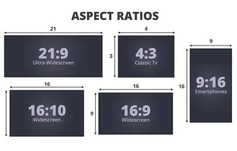
Image clarification: the illustration below compares 21:9, 4:3, 9:16, 16:10 and 16:9. The vertical “9” beside its 16:10 rectangle is a labeling error: 16:10 means 16 units wide and 10 units high.
6. What screen aspect ratio fits your project: a decision matrix
| Application | Starting Ratio | Illustrative Pixel Pitch | Notes |
|---|---|---|---|
| Stage backdrop (concerts, events) | 16:9 | P2.5–P4 | Check camera feeds and slide dimensions |
| Conference room | 16:9 or 16:10 | P1.2–P2.0 | Check text size and native pixel height |
| Church video wall | 16:9 | P1.8–P3 | Match the actual presentation and camera outputs |
| Retail window | 9:16 or 16:9 | P2.0–P4 | Vertical fits narrow storefronts |
| Outdoor billboard (DOOH) | 16:9 | P3–P6 | Follow the advertising network’s canvas specifications |
| Control room / NOC | 16:10 or 32:9 | P0.9–P1.8 | Dashboards benefit from width |
| Creative installation | 1:1 or custom | Varies | Match ratio to the concept |
| Immersive cinema | 21:9 | P1.5–P2.5 | Match the exact film ratio; 21:9 is not identical to 2.39:1 |
| Menu board (QSR) | 32:9 or 16:9 | P2.0–P4 | Ultra wide fits above counters |
The ratios above are starting points, and the pitch ranges are illustrative rather than specifications. Final pitch depends on viewing distance, text size, environment and budget. Confirm the native canvas and the actual content before using a row as a purchasing brief.
Stage displays: many HD camera feeds and slide decks use 16:9, but a stage designer may specify a wider mapped canvas. Preserve the camera image in a suitable window and design graphics for the remaining area. Test the camera, switcher and playback outputs together.
Retail and outdoor advertising: portrait assets may work well on 9:16 displays, but check resolution, codec, orientation and content rights before reuse. Outdoor advertising networks have their own delivery specifications; 16:9 is not a universal requirement. Request the exact canvas and safe-area rules.
Control rooms: at the same horizontal resolution, 1920 × 1200 provides 120 more pixel rows than 1920 × 1080. A 32:9 canvas can provide more horizontal workspace when its pixel count supports it. Actual readability still depends on text scaling, source layout and viewing distance.
7. Common screen aspect ratio mistakes
Confusing ratio with detail. A finer pitch can put more pixels into the same physical area, but it does not change the shape of the display. Choose the aspect ratio for the layout, then choose sufficient native pixels to show the smallest important text at the intended distance.
Assuming every file must match the wall pixel for pixel. A 1280 × 720 video can scale proportionally to a 1920 × 1080 display because both are 16:9. Matching native resolution can improve pixel mapping, but different resolutions do not automatically cause distortion. Different ratios require a deliberate fit, crop or stretch choice; avoid stretching logos and faces.
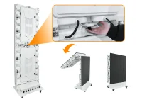
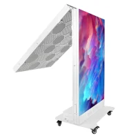
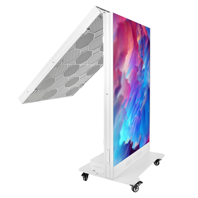
Dismissing 4:3 without checking the brief. It can remain appropriate for archive material, data layouts or a fixed opening. Test the real sources before replacing it with a wider screen. For a separate portrait signage requirement, a foldable poster LED display is a different format to assess on its own dimensions and content needs.
Expecting every movie to fill 21:9. Films use several aspect ratios, and an ultrawide marketing label does not establish the exact screen shape. Preview representative titles and agree on borders or cropping. For presentations, extra width can carry a sidebar or second window if the content and processor are designed for it.
Assuming a custom ratio always needs custom spare parts. A custom wall may use standard cabinets arranged in a different grid. The maintenance requirement depends on the actual modules, receiving cards, power supplies and cabinet model. Confirm compatible spares and service access for both standard and custom layouts.
8. FAQs
9. Conclusion
16:9: a practical baseline for landscape video and presentations when it matches the source material.
4:3: useful for archive content, suitable data layouts or an existing space that favors a taller shape.
21:9 or 32:9: useful for panoramic content or multiple windows when the exact canvas and production workflow are planned together.
9:16: a natural fit for portrait layouts, provided the files, player settings and viewing position support that orientation.
1:1: a square option for matching architecture or purpose-designed graphics; 16:10 offers a slightly taller landscape workspace.
Choose the screen aspect ratio from the content and available space, then confirm active width and height, native pixels, pixel pitch and processor capacity. Sign off a test layout—including fit or crop behavior, text safe areas and service requirements—before ordering the LED wall.
 How to Choose the Best Pixel Pitch for LED Displays
 12 LED Screen Manufacturers and Suppliers Serving Russia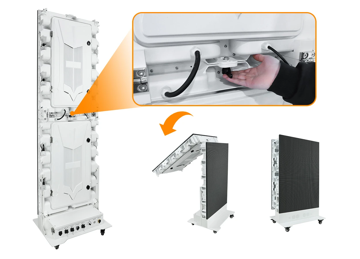
Fill In Your Needs In Detail
Fill in the screen usage scene and size you need in “Content”.You will get a quote.